Serpentine’s simplification of their website navigation and content

SerpNav - Image

Visit Site

Project Objective

Serpentine Galleries, a contemporary art institution in London, sought to enhance the user experience on their website.

Their primary goals were to improve website navigation and simplify their ‘What's On’ page with intuitive filters and declutter its content. They aimed to increase visitor footfall to the galleries and make it easier for their online audience to consume relevant content.

The Challenge
Serpentine Galleries Identified a long term vision to increase visitor footfall numbers to their galleries but faced challenges with their website, primarily with the navigation and how their content was organised on the ‘What’s On’ page.
Serp Nav - Old Image

Their existing navigation presented itself with too many options with no clear indication or hierarchy as to where visitors need to go. Additionally, the ‘What's On’ page needed to be improved to bring front and centre the breadth of exhibitions and events they had to showcase while providing visitors flexibility in filtering what they saw.

Our Approach

We conducted an extensive review into Serpentine’s website and collaborated closely with their team to understand the organisation’s specific needs and key performance indicators (KPIs). To ensure that our solutions aligned with their goals, we conducted an on-site content modelling workshop.

During the workshop, we worked closely with Serpentine’s marketing team to define how the navigation and ‘What’s On’ content should be structured, positioned, and prioritised on the website. As well as gathered insights from the team, we also paid close attention to their competitors to observe how similar organisations had tackled similar challenges on their own websites. This hands-on approach allowed us to gather insights directly from the people who understand the galleries’ mission and visitor expectations best.
The Solution

Based on the insights gained from the content modelling workshop, we implemented the following solutions:
Serp Nav - New Img
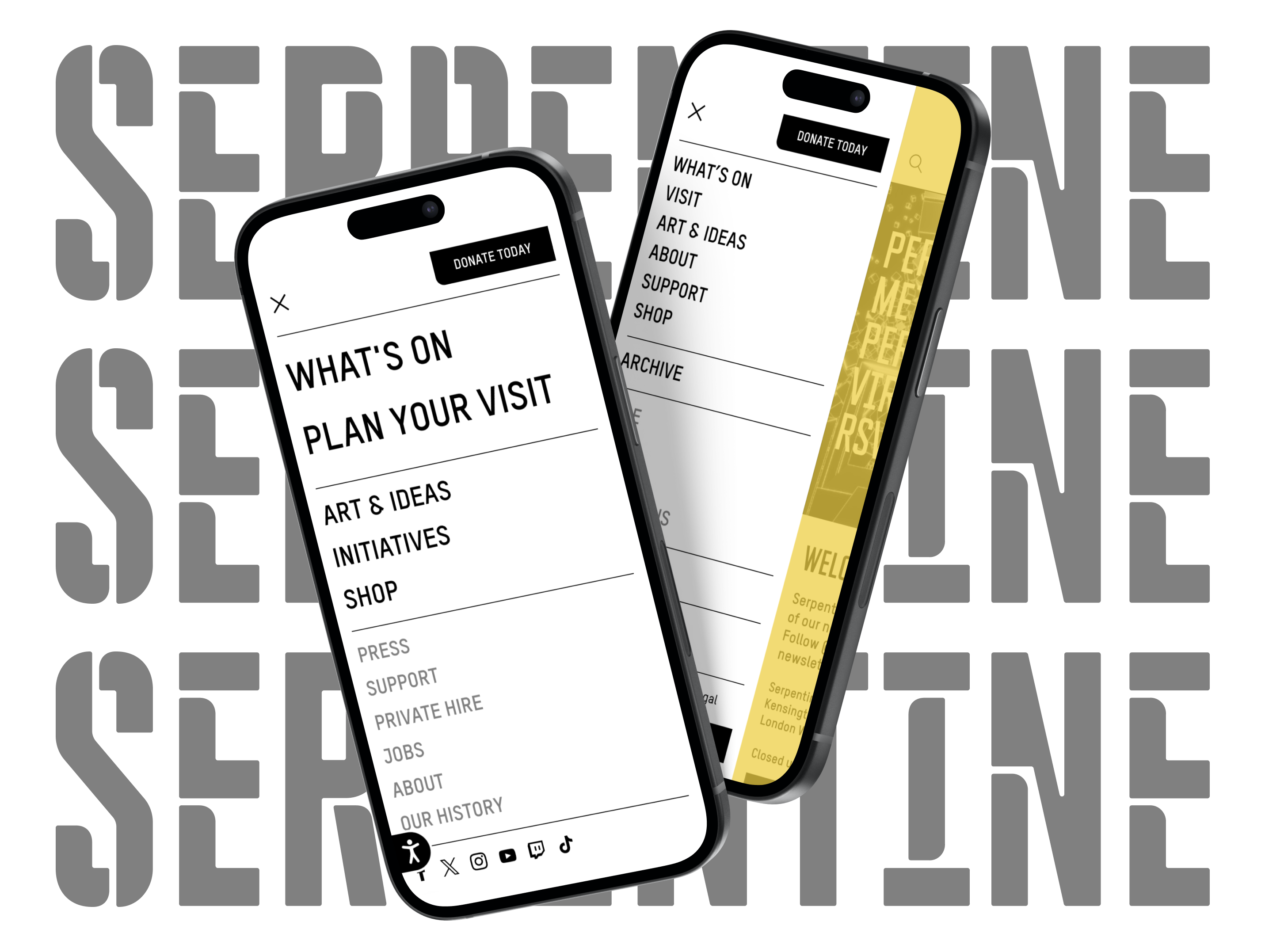
  • Improved Navigation: We redesigned the website's navigation structure, ensuring that visitors could easily access information about What’s On - exhibitions, events, and projects etc., as well as visit information. We saw an opportunity to dramatically declutter the options within the nav and articulate, in clear language, what we wanted our visitors to do - Leading with ‘What’s On’ & ‘Plan your visit’.
  • ‘What’s On’ content Hierarchy: We proposed a restructure to the ‘What’s On’ in how their exhibition and events were served. This was done by the introduction of clear segmentation between categories and greater focus on encouraging visitors to attend the galleries in- person.
  • Intuitive Filtering: We identified the primary categories of filter content that needed to be highlighted, such as exhibitions, events, digital, public art and projects. Also, enabled users to quickly find events based on their broader preferences, including date and location.

Results:

The implementation of these solutions led to significant improvements in Serpentine’s online presence and visitor numbers:

Serp Stats 1

‘What’s On’ Filtered URLs:

Visitors were quick to find what they needed from landing on the What’s on page - as we saw visitors interacting less with the filters on the what’s on page.

Serp Stats 3

Average engagement increased ‘Plan your visit’

Serp Stats 4

Conclusion:

In summary

Our holistic approach, including the on-site content modelling workshop, successfully addressed Serpentine’s challenges. By aligning our solutions with their KPIs and improving website navigation and content organisation, we played a pivotal role in enhancing the galleries’ online presence. Working hand in hand to implement further enhancements for the future we continue to ensure their online presence remains at the forefront of contemporary art engagement.

Like what you see?

Contact Us